My company, “Vertical Roots”, is a small mountain resort that truly embodies the outdoorsy mindset and lifestyle. It is a mountain that, rather than having a lift, helicopter, or cat-skiing operation, it is only accessible via hiking/snowshoeing up the mountain. This idea goes back to the roots of skiing, long before there were chairlifts, long lines, and expensive lift tickets. Many skiers, especially those who frequently ski tour (Hike miles into the backcountry to “earn their turns”) love to get as many vertical feet of skiing in a day as, in many cases, these people only get one or two runs a day. My company would provide variable and easily-accessible terrain at a very inexpensive price as the company would greatly cut their expenses without hefty chairlifts to power. Many outdoor enthusiasts live an easy-going lifestyle and typically believe in sustainability, environmental preservation, local business and saving money, as outdoor activities and the resulting lifestyle can be quite expensive. My company demonstrates such ideas via cheap lift tickets, a much smaller carbon footprint (compared to large ski resorts), and smaller crowds (as the market for backcountry skiing is greatly reduced compared to those who one ski at lift-accessible resorts.
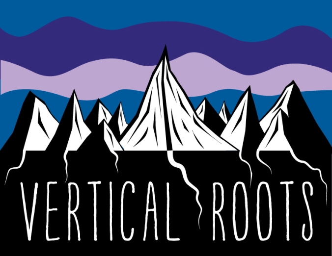
Outdoor enthusiasts, especially skiers, are also the type of people who don’t mind getting dirty, waking up early, and being cold. This is one of the reasons for the ruggedness of the mountains and contour lines. “Rugged” is a nice adjective to describe the people that would frequent Vertical Roots. As mountains themselves, rocks/cliffs, trees, shapes, and angles associated with mountains are sharp, steep and near vertical whenever you look at them, I thought the name “Vertical” in the title would be fitting. Equally as fitting are the lines that are inside and connect to make the mountain shapes.
Some words that may be associated with skiing and the experience that one may have during a typical day of skiing are: Early mornings, late nights, cold, winter, active and snow. I have represented such descriptors in the sky behind the mountains. The horizontal, yet organic lines help in creating movement which is realistic in the mountains as new storm cycles are always cycling in and out. The sky looks turbulent, which is a portrayal of how the weather can be difficult or even unpleasant to ski in. Despite the turbulent nature of the sky in my logo, the mountains, especially the main one, look intimidating, steep, and enjoyable for not-your-average ski enthusiasts who will be frequenting the mountain. The hues of the sky contain one primary and two secondary colors. These contrast nicely but are not unpleasant to the eye. The value of the pinkish color is lighter than that of the purple. The colors are cooler colors whose temperature clearly is colder, passing such sense on to the viewer and their imagination of what Vertical Roots and our experience is.
Although mountains obviously don’t have roots of their own, the trees that live on them do. I chose an abstract image of the mountains with roots extending below them towards the title. I think that the play on the positive/negative space helps in creating a visually stimulating image and one that will not only catch, but please the viewer’s eye. The roots dig deep down, almost like when someone digs deep into their soul and conscience while out in the middle of the mountains. The silence, isolation, and time for though is an enchanting experience—one that will be enhanced while avoiding the lift lines and noisiness while at Vertical Roots.
When looking at the image, the viewer’s eye is attracted to the middle part of the main mountain. I think this is a good thing because one can easily look side-to-side and get more of the landscape/detailed view. Or the viewer can look up from this point to notice the sky with its feeling of movement and depth. Or lastly, the viewer can look down where the title is clear, large, and isolated. When focusing on the title, the viewer is not distracted. But while they aren’t distracted, the roots that extend from the mountains towards the title help in keeping the image connected.
I think that the typeface, “Mountain Retreat”, does an awesome job of keeping an organic, local, and natural feel, which are all feelings that Vertical Roots strives to stimulate. It possesses straight lines, which compliment the sharp lines in the individual mountains. It is also a tall typeface, giving the sense of height, verticalness, and steepness. The typeface, isolated yet connected, is the final and crucial part in completing my logo and further demonstrating the beliefs and goals of the company.
Lastly, the way that the smaller mountains are orientated compared to the main, Middle Mountain is in a way that is almost pointed towards the middle mountain. Aside from being smaller and having different details compared to the main mountain, the single contour line that each has is made so that it gives the feeling of reflection towards the main mountain. This is to give the effect that the middle mountain is the largest, steepest mountains that surrounding mountains yearn to be. This is a great representation of our company wants to achieve. Since there are no recreational mountains that offer what we offer, we hope to create a new market and precedent for what skiing should be all about.
